
Seasonal Trends in Pigments: What to Expect and How to Prepare


Understanding Seasonal Trends in Pigments
The world of pigments is ever-evolving, with seasonal changes greatly influencing color trends. As the year progresses, designers and manufacturers look to adapt their palettes to reflect the natural shifts in light, temperature, and mood. Understanding these trends not only keeps your products relevant but can also inspire creativity and innovation in your designs.
Each season offers a unique array of colors that can evoke specific emotions and set the tone for various applications, from fashion to interior design. Staying abreast of these changes can give your projects a fresh and timely appeal.
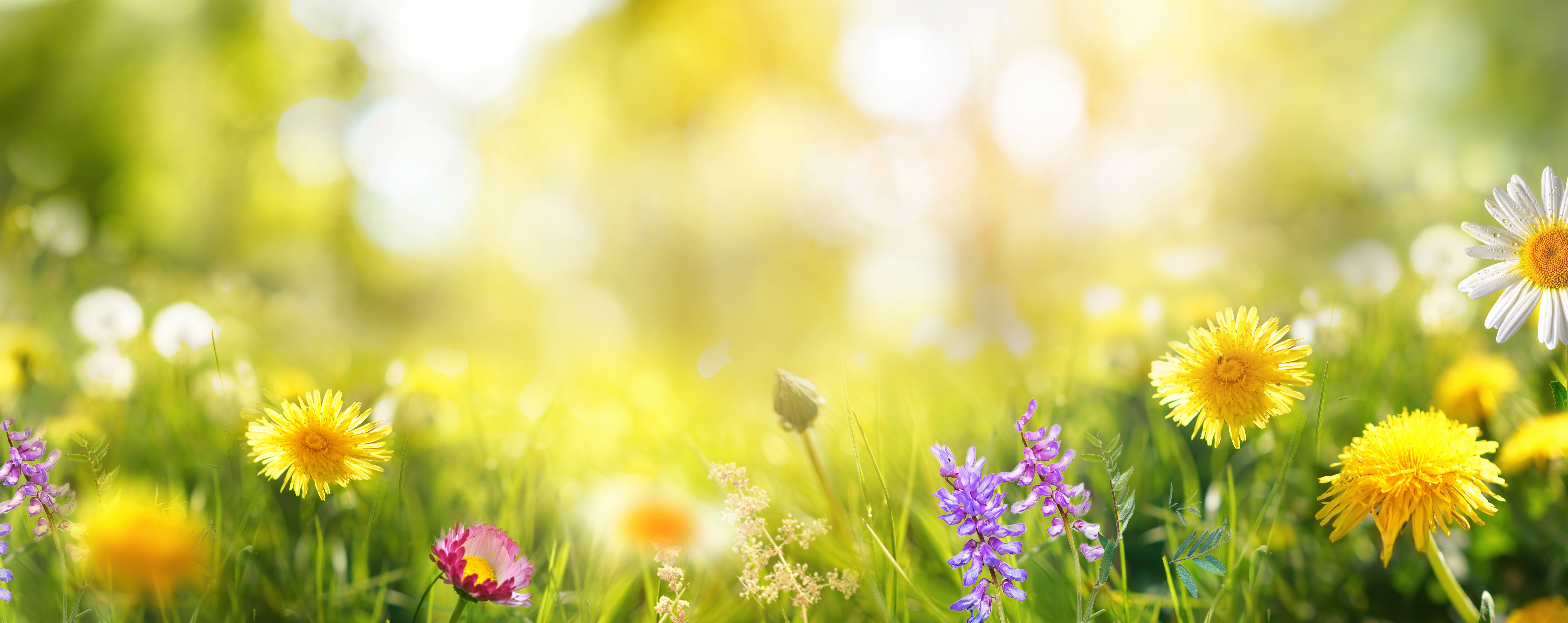
Spring: Embracing Renewal and Freshness
Spring is synonymous with rebirth and rejuvenation, and this is reflected in the pigments popular during this season. Expect to see a surge in pastel shades, reminiscent of blooming flowers and new growth. Soft greens, pinks, and blues dominate, creating a sense of calm and optimism.
To prepare for spring trends, consider integrating these softer hues into your product lines. Whether it’s a subtle accent or a bold statement, incorporating spring colors can bring a refreshing update to your offerings.
Summer: Capturing Vibrancy and Energy
Summer is all about bold and vibrant colors. Think of the warm yellows of the sun, the deep blues of the ocean, and the bright reds of summer fruits. These pigments are designed to capture the energy and liveliness of the season.
To align with summer trends, consider using these vibrant colors in your designs. Whether through textiles, paints, or digital media, these shades can invigorate your work and attract attention.
- Incorporate bright hues in your marketing materials.
- Experiment with bold color combinations.
- Use pigments that reflect light to enhance vibrancy.

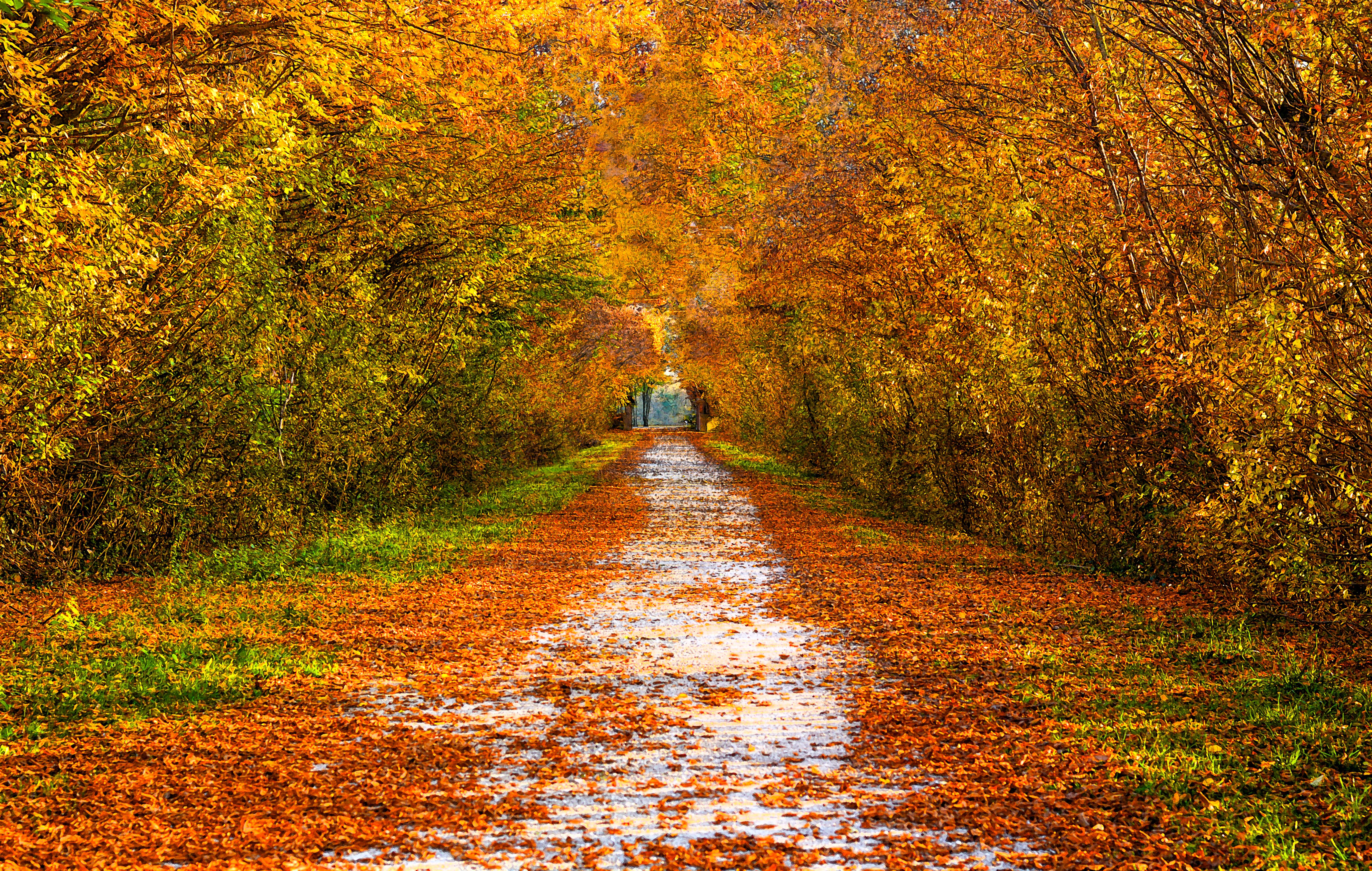
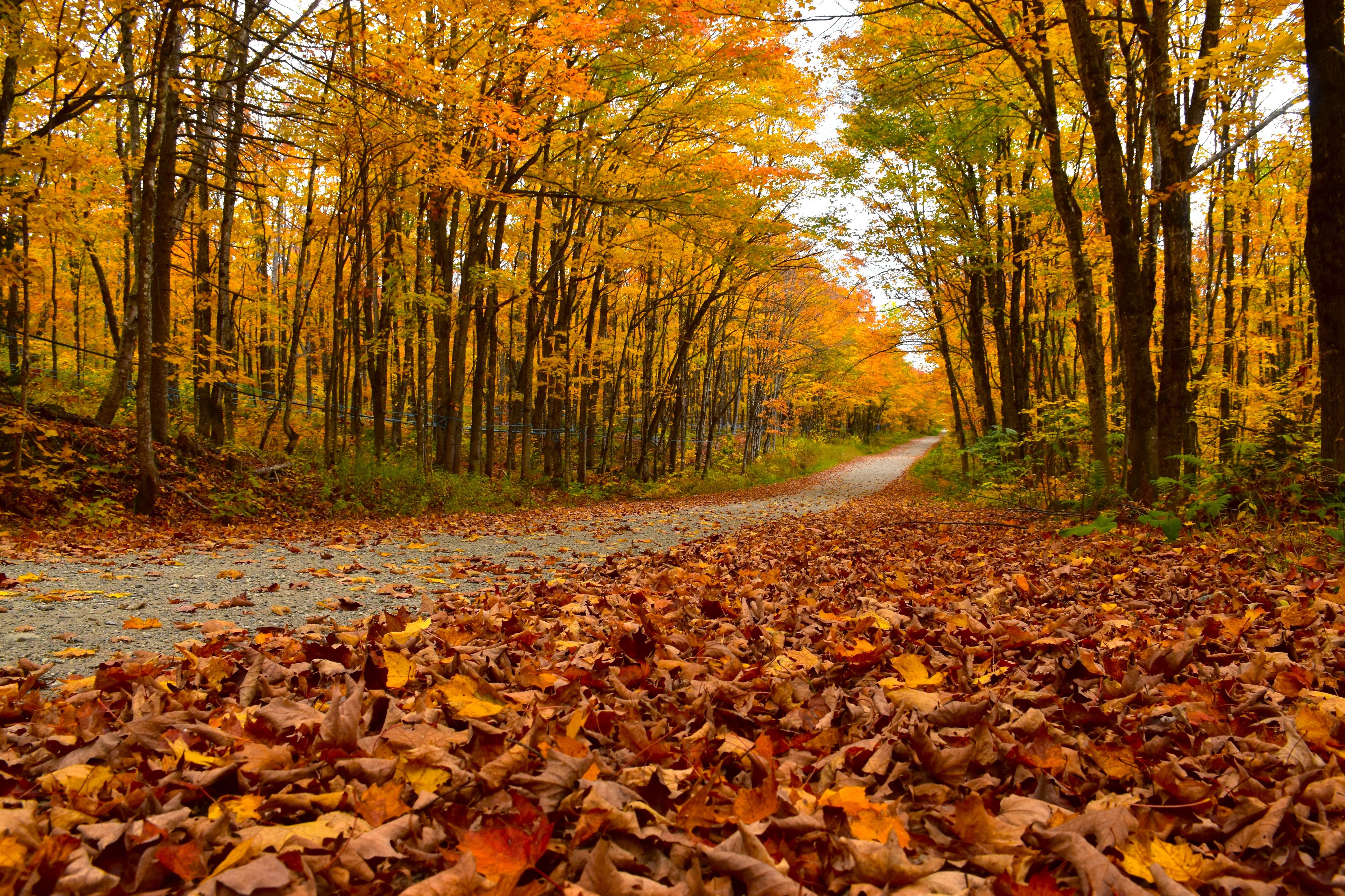
Autumn: Reflecting Warmth and Comfort
As the leaves change, so do the pigments. Autumn colors are rich and warm, inspired by nature’s transformation. Deep oranges, browns, and muted yellows evoke a sense of coziness and nostalgia.
Preparing for autumnal trends involves embracing these earthy tones. They work well for products that aim to convey warmth and comfort, such as home decor and fashion textiles.
Winter: Showcasing Elegance and Simplicity
Winter brings a palette of cool, subdued colors. Think icy blues, deep silvers, and rich burgundies. These pigments add a touch of elegance and sophistication to any product.
To incorporate winter trends, focus on simplicity and contrast. These colors can create striking effects, especially when paired with metallics or textured surfaces. Consider using these tones for holiday-themed designs or luxury items.

Final Thoughts: Staying Ahead of the Curve
Understanding and anticipating seasonal pigment trends can significantly enhance your design strategy. By preparing ahead, you can ensure your products remain relevant and appealing throughout the year.
Stay informed by following industry reports, attending color trend workshops, and experimenting with new pigment applications. Embrace the changing seasons as an opportunity to innovate and inspire with your designs.